Product & UX Design Case Studies

Hertz Minilease
A car subscription platform for the Swiss market, built around two parallel user journeys and live inventory data.
ROLE
UX/UI Designer
CLIENT
Hertz Switzerland
AGENCY
Dreifive
YEAR
2019

CONTEXT
Hertz Switzerland was launching MiniLease, a new car subscription product for both private and business customers, starting from a 30 day minimum. The goal was a platform where users could browse, filter, compare and configure vehicles entirely on their own, then turn the inquiry into a structured handover to a Hertz sales contact.
The challenge: the same flow had to work for two very different audiences, run on real time inventory data, and feel both premium and fast.
GOAL
Let private and business customers find, compare and request the right car on their own, in a few clear steps, and turn each inquiry into a qualified lead the Hertz sales team could act on immediately.
MY ROLE
I led UX and UI alongside one other designer, end to end. Stakeholder workshops, user flows, wireframes, responsive UI, design system, and a lightweight backend interface for the Hertz team to manage vehicle inventory themselves.
Tools: Figma for design and prototyping. Adobe Creative Suite for asset preparation. The platform was built on a CMS based architecture, designed so the Hertz team could update vehicle inventory, images and pricing without engineering involvement.
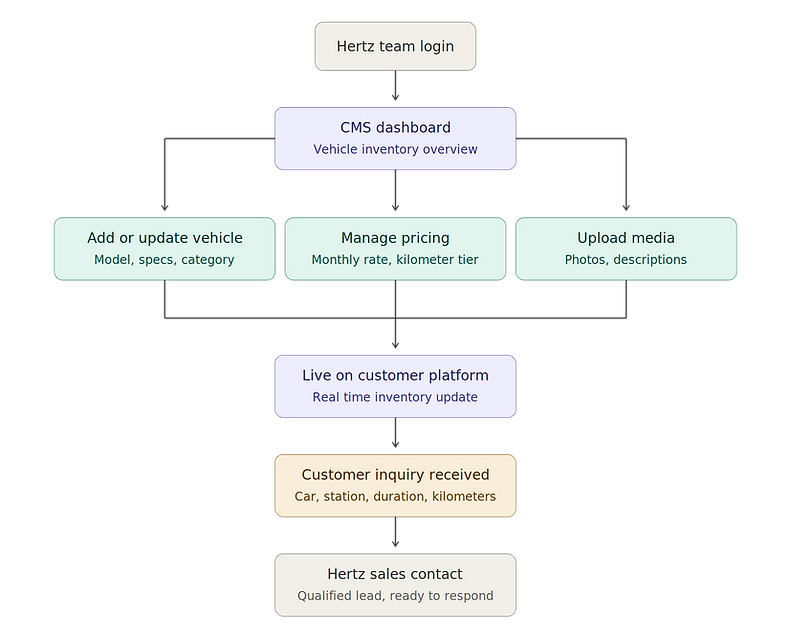
THE CUSTOMER FLOW
The structure mapped onto a simple decision sequence: category first, then browsing and filtering, then comparison, then a registration prompt only when the user was ready to act.

THE ADMIN SIDE
While the customer-facing flow focused on speed and clarity, the platform also needed a backend side. A CMS interface let the Hertz team manage vehicle inventory themselves, and the inquiry form fed structured data straight to the sales contact as a qualified lead.
KEY DECISIONS
-
Category selection before browsing the full inventory
Showing all vehicles upfront overwhelmed users. A pre selection step segmented users early and made the offers feel curated.
-
Two parallel flows: guest and registered
Guest users could browse freely. Registered users had saved preferences and could return mid decision without restarting.
-
Structured inquiry to sales
The form sent qualified data (car, station, duration, kilometer package) straight to the Hertz sales contact, not a blank email. Both sides benefited.
-
One consistent data structure across every vehicle
For comparison to work, every car had to present the same fields in the same order, regardless of model or category. We aligned the vehicle data structure with the Hertz team early, so the inventory stayed comparable as it grew. This made the platform feel trustworthy, not improvised.
-
Visual hierarchy that pointed users toward action
The interface used Hertz's brand color sparingly and deliberately, reserved for primary actions and pricing, so the most important next step was always visually obvious. Everything else stayed quiet. This kept a content-heavy platform feeling calm and made the path to inquiry clear at a glance.

TESTING
With no budget for external user research, we built testing into the process using the resources we had: colleagues from non design teams as proxy users, and structured sessions we could run ourselves.
-
Moderated usability sessions
We ran task based sessions with colleagues who hadn't worked on the project, giving them realistic goals ("find an SUV available in Zurich with a 1,500 km monthly package") and observing where they hesitated, misclicked, or abandoned the flow. These sessions surfaced the most actionable problems.
-
First click and navigation checks
We tested where users clicked first when given a task, which revealed whether the category-first structure actually matched how people expected to start their search.
-
Heuristic review within the design team.
We evaluated the interface against established usability principles, catching consistency and clarity issues before testing.
The most valuable fixes came from these sessions: simplifying the kilometer package selector after testers kept picking the wrong tier, adding "what's included" tags once users repeatedly asked whether insurance was covered, and making the inquiry form feel like a confirmation, not a sales gate.
The honest limitation: budget didn't allow testing with actual Hertz customers. In house sessions surface interaction issues, but not the real life context that shapes how people choose a car. In hindsight, I'd involve real users earlier, even informally.

OUTCOME
The platform launched and continues to operate today at hertzminilease.ch. The visual language has evolved significantly since launch, but the structural foundation remained: category based filtering, the dual private and business flow, the structured inquiry handover.
www.hertzminilease.ch
Dentist Finder
A self-initiated concept for a platform that helps patients find and book the right dentist, with a companion app for managing appointments and profiles.
ROLE
Product & UX/UI Designer
SCOPE
Concept, UX, UI, end to end
STATUS
Concept, not launched
YEAR
2017

CONTEXT
This was my own idea, taken from concept to full design. I owned the product thinking, user flows, UX and UI, working with a backend developer on technical feasibility. The project wasn't taken to launch, but it's the first work where I moved fully into product design: defining the problem, the audience, and the solution from scratch.
GOAL
Hungary has many dental clinics looking for patients from abroad, while Western European patients travelling for affordable care struggle to compare clinics before committing to a trip. The platform connected both sides: a channel for clinics to reach patients, and clear, comparable information so patients could choose with confidence before travelling.


